From Packets to Pictures: Network Visualizations for DFIR
A visualization is useful only if it helps an analyst prove or reject a hypothesis. A PCAP is still the evidence. The graph is a way to see structure faster: who talked to whom, when, over which protocol, how often, and how much data moved.
In DFIR, this matters because raw packet lists are too flat. A compromised workstation might generate DNS lookups, TLS sessions, Kerberos traffic, SMB authentication, and outbound transfers in the same five-minute window. Looking at those packets one by one hides the shape of the event. A good visualization exposes that shape without replacing packet-level validation.
This article covers four visualizations available in A-Packets that are worth using during PCAP analysis. For each one, the important question is the same: what does the suspicious pattern look like in the actual capture?
TL;DR
- Topology graphs expose host relationships, fan-out, and lateral movement paths.
- Flow diagrams show where most bytes moved and whether data left the expected boundary.
- Traffic by protocol over time reveals protocol-mix changes and timing patterns such as C2 beaconing, scans, and off-hours bursts.
- GeoIP and ASN maps add external context, but must be verified against DNS, SNI, certificates, and business logic.
1. Node-Link Connection Graphs
A node-link graph turns hosts into nodes and conversations into edges. Edge color can represent protocol. Edge weight can represent bytes, packets, or session count. For incident response, this is the fastest way to see whether a host is acting like a client, server, scanner, relay, or staging point.
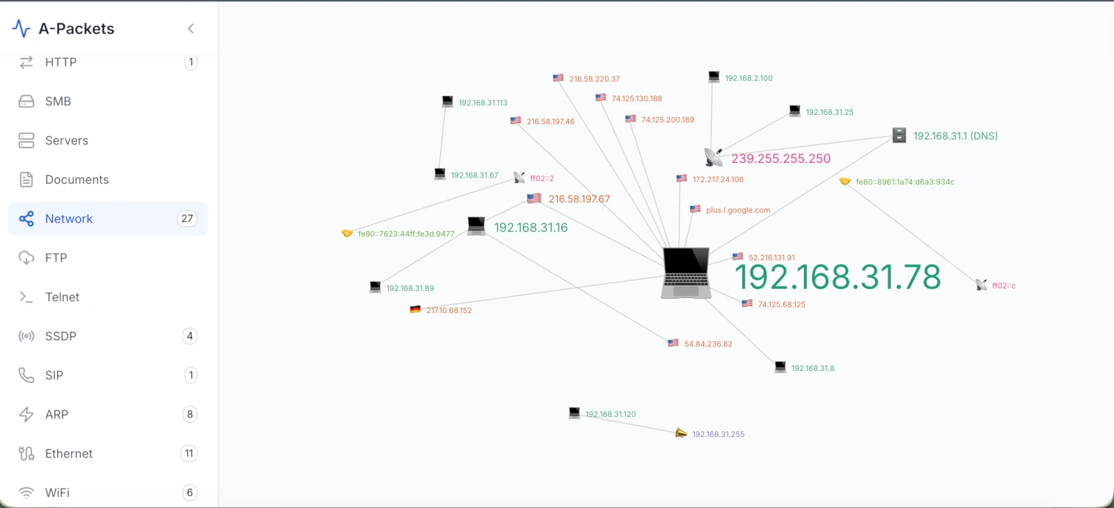
What It Shows in the PCAP
In packet terms, the graph is built from 5-tuples and protocol metadata: source IP, destination IP, source port, destination port, protocol, timestamps, packet counts, and byte counts. For SMB or Kerberos, the graph becomes more useful when authentication context is available. A single workstation creating new SMB sessions to multiple servers is a different signal from a workstation making normal HTTPS requests to SaaS providers.
DFIR Example: Lateral Movement
A capture from a user VLAN shows 10.20.14.37 opening SMB sessions to 10.20.1.10, 10.20.1.11, 10.20.2.20, and 10.20.2.21 within two minutes. In the PCAP, the evidence is TCP/445 fan-out, SMB2 session setup, NTLMSSP authentication, tree connects, and DCE/RPC traffic. The graph makes the fan-out obvious; the packet details confirm whether it was admin activity, vulnerability scanning, or adversary movement.
2. Conversation Flow Diagrams
Flow diagrams show how traffic volume moves between sources and destinations. The width of the line usually represents bytes or packets. This view is useful when the question is not "who connected?" but "where did the data go?"
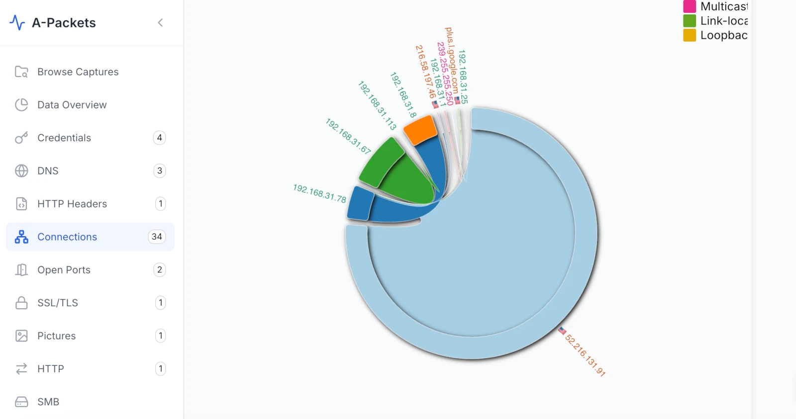
What It Shows in the PCAP
A flow diagram is backed by byte counters, session direction, timestamps, and sometimes protocol labels. If an internal host sends 800 MB to an external IP over TLS, the visual line should map back to TCP sessions with matching byte counts. If the same host first pulled files from SMB and then sent data outside, the sequence matters.
DFIR Example: Exfiltration Through a Staging Host
A PCAP shows 10.30.8.12 reading large files from 10.30.2.50 over SMB, then sending a long TLS stream to 203.0.113.77. The flow diagram highlights the path: file server to workstation, workstation to external endpoint. In the packets, you should see SMB read activity, a later TCP/TLS session, high outbound byte count, and timing that links the two stages. Without the timing and byte counters, "exfiltration" is only a hypothesis.
3. Network Traffic by Protocol Over Time
This view plots traffic volume on a time axis, broken down by protocol. It answers two questions at once: which protocols dominate the capture, and when activity happened. A steady, predictable protocol mix looks different from a capture where DNS suddenly spikes or one host talks to a destination on a fixed interval.
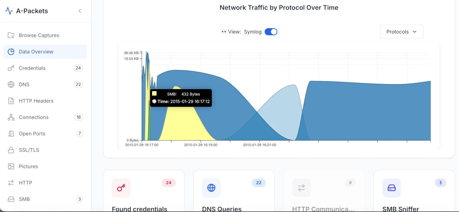
What It Shows in the PCAP
The chart is a summary of parser output over time: DNS, HTTP, TLS, SMB, LDAP, Kerberos, FTP, Telnet, RDP, SIP, SSDP, and unknown traffic. The useful part is the delta from expectation. Telnet in a production network, FTP credentials in cleartext, a large "unknown" bucket over TCP/443, or a protocol that spikes at a regular interval should trigger deeper review.
DFIR Example: Tunneling Candidate
A branch-office capture shows DNS consuming far more traffic than normal. In the PCAP, the suspicious pattern is not just "many DNS packets." Look for long high-entropy subdomains, repeated TXT queries, high NXDOMAIN ratios, unusual resolver destinations, and stable request timing. The chart tells you where to look. The DNS records decide whether the hypothesis survives.
DFIR Example: C2 Beaconing
A workstation at 10.40.6.18 opens TLS sessions to 198.51.100.44 every 60 seconds for 30 minutes. Each session contains a small client-to-server payload and a small server response. The PCAP evidence is the interval, destination stability, DNS or SNI context, TLS certificate metadata, and low but consistent byte counts. The time view makes the rhythm visible. Packet inspection determines whether it is C2 or a legitimate agent.
4. GeoIP & ASN Map Overlays
GeoIP and ASN views map external IPs to countries, regions, and network owners. They are context tools, not proof. IP geolocation can be wrong, VPNs and CDNs distort location, and cloud providers host both legitimate services and adversary infrastructure.
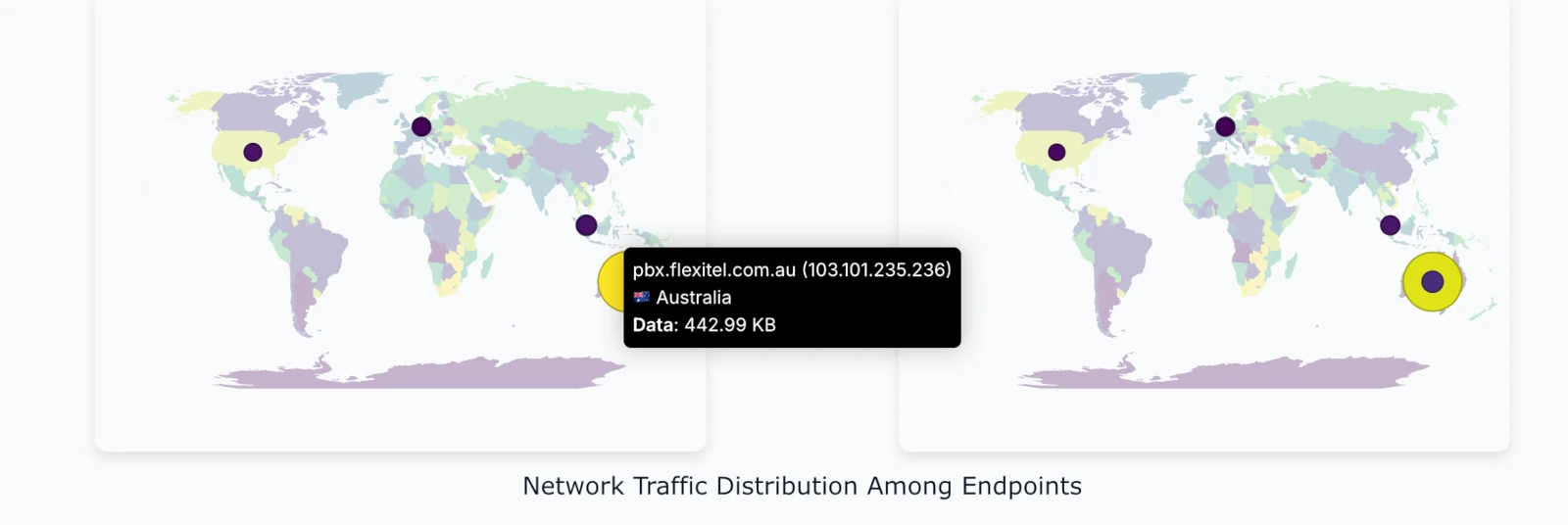
What It Shows in the PCAP
The map is built from external destination IPs, sometimes enriched with ASN and reverse DNS. To make it useful, correlate the map with DNS queries, TLS SNI, certificate subject names, JA3 or TLS fingerprints if available, HTTP Host headers, and byte counts. A single packet to an unexpected country is weak evidence. A long outbound TLS stream to an unknown ASN after local file access is stronger.
DFIR Example: Suspicious Cloud Destination
An engineering workstation sends 300 MB over TLS to an IP in a hosting ASN that the company does not use. In the PCAP, the case improves if DNS shows a random-looking domain, SNI does not match an approved SaaS provider, the certificate is newly issued or self-signed, and the transfer follows SMB reads from an internal repository. The map raises the question. The packet timeline answers it.
DFIR Example: Device Calling Home
An appliance or IoT device communicates with an external IP that is not documented by the vendor. The PCAP evidence should include the device MAC address, DHCP hostname if present, DNS name, destination ASN, protocol, interval, and payload size. This is often where "suspicious" becomes "needs vendor confirmation," not "confirmed compromise."
How to Use These Views in an Investigation
Do not start by admiring the graph. Start with a question.
- What changed? Use the protocol-over-time view and the topology graph to spot unusual services, hosts, or edges.
- When did it happen? Read the same protocol-over-time view to isolate the first event, peak activity, and end time.
- Which hosts are involved? Use the node-link graph to separate source, destination, relay, and service roles.
- How much data moved? Use a flow diagram to quantify bytes and direction.
- Is the external destination expected? Use GeoIP and ASN as context, then verify DNS, SNI, certificates, and payload metadata.
The output should be a timeline and a set of packet-backed facts: host, timestamp, protocol, destination, byte count, payload indicator, and confidence level.
Comparison Table
| Visualization Type | Primary Use Case | Suspicious Pattern | PCAP Evidence to Check |
|---|---|---|---|
| Node-Link Graph | Host relationships | New internal fan-out or unexpected external edge | 5-tuples, SMB session setup, authentication context, timestamps |
| Flow Diagram | Data movement | Large outbound stream or staged transfer | Byte counts, direction, session timing, source and destination roles |
| Protocol Over Time | Protocol mix and timing | Weak protocol, DNS surge, periodic activity, off-hours burst | Parser output over time, intervals, byte counts, destination stability |
| GeoIP / ASN Map | External context | Unexpected country, ASN, or cloud provider | DNS, SNI, certificate, HTTP Host, byte counts, business context |
Common Mistakes to Avoid
Visualizations reduce cognitive load, but they also make it easy to overstate findings.
- No baseline: a busy topology graph is not automatically suspicious. Compare against a known-good capture from the same segment, day, and business cycle.
- Over-filtering: removing DNS, DHCP, ARP, or Kerberos too early can hide the start of the incident. Filter iteratively and preserve the original capture.
- Confusing anomaly with compromise: unusual traffic is a lead. It becomes a finding only when packet evidence supports it.
- Ignoring direction and volume: one connection to an odd IP is weaker than a long outbound transfer after internal file access.
- Trusting GeoIP too much: geolocation is context, not evidence. CDN, VPN, and cloud routing can mislead.
Bottom Line
A good PCAP visualization does not tell you what happened by itself. It tells you where to look. The finding still has to be backed by packets: timestamps, flows, protocols, payload indicators, and host relationships.
Use topology to find relationships. Use flow views to quantify movement. Use the protocol-over-time view to spot protocol shifts and test timing. Use GeoIP and ASN context for external destinations. Then go back to the packet details and write only what the evidence supports.
At apackets.com, the goal is to make that workflow faster: upload a PCAP, inspect the visual shape of the traffic, pivot into protocol details, and keep the final conclusion tied to observable network evidence.
Frequently Asked Questions
What does C2 beaconing look like in a PCAP?
Repeated sessions to a stable destination at regular intervals (e.g. every 60s), each carrying small, consistent request/response payloads. Confirm with the interval, SNI/DNS context, TLS certificate metadata, and low-but-steady byte counts before calling it C2 rather than a legitimate agent.
How can you spot lateral movement in network traffic?
Look for a single host fanning out new SMB sessions (TCP/445) to multiple servers in a short window — SMB2 session setup, NTLMSSP authentication, tree connects, DCE/RPC. A node-link graph makes the fan-out obvious; packets confirm whether it's admin activity, scanning, or an adversary.
Can GeoIP location be trusted as evidence in a network investigation?
No. GeoIP is context, not proof. VPNs, CDNs, and cloud providers distort location. Correlate with DNS, TLS SNI, certificate subject, JA3 fingerprints, and byte counts before drawing conclusions.
Need to inspect the shape of a capture before writing the report?
Upload PCAP to A-PacketsUse free public analysis for sanitized traces. Use private plans for sensitive incident evidence.